· Mark Davis · Board Relationship · 11 min read
3. 📈 KPI Roulette: The Art of Constantly Changing Metrics to Confuse Your Board
Ever wondered how to keep your board of directors endlessly guessing—and mildly frustrated—with your startup's performance? Welcome to "KPI Roulette," the satirical CEO playbook on creatively redefining metrics, blending timelines, and presenting numbers so obscurely even you forget what they mean. Master these techniques to make your startup board of directors responsibilities feel more like improv theater than governance—just make sure your D&O insurance for startups is paid up first.

A post from “The Startup CEO’s Guide to Mastering Boardroom Chaos”
🚨 Disclaimer: This guide is purely satirical and intended for entertainment purposes only. Any attempt to follow this advice might significantly increase friction with your board of directors, complicate your startup board of directors responsibilities, or void your D&O insurance for startups. Proceed responsibly—or better yet, don’t proceed at all.
📖 Introduction

Every seasoned startup CEO knows the existential dread of opening their dashboard just days before the quarterly board meeting, realizing the numbers lack… charisma. If your metrics aren’t giving “main character energy,” maybe it’s time they learn a new script.
When you’re juggling the demanding expectations of your board of directors, adhering strictly to things like clarity and honesty is… optional at best. Sure, your startup board of directors responsibilities might include fiduciary oversight and strategic guidance, but they definitely don’t say anything about consistent metrics.
Welcome to KPI Roulette: the not-so-ancient art of shifting metrics just enough to imply momentum, while dodging inconvenient truths. Whether your churn is creeping, growth is sleeping, or engagement is… theoretical—this guide is here to help you reframe the narrative with confidence and vague terminology.
Because let’s face it: startups move fast, definitions evolve, and if you’re still measuring the same thing quarter to quarter, are you even pivoting?
1. “Active Users: Redefine Them Until They Behave”
Because nothing says growth like changing the definition of growth
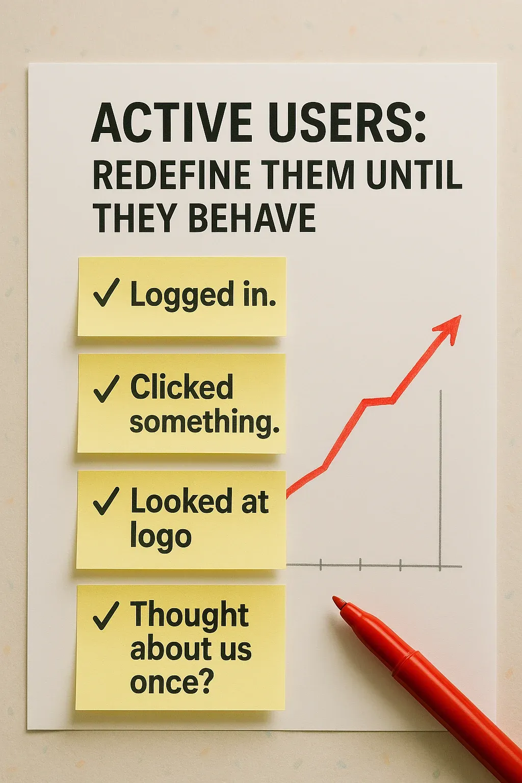
Every startup metric begins its life with a clear definition. Then performance stalls. Suddenly, that clarity becomes… negotiable.
Whether it’s active users, qualified leads, feature complete, or retention, one truth holds: if the numbers don’t look good, you can always redefine the category. Quietly. Strategically. Mid-quarter.
Take “active users.” At first, it means “anyone who logs in.” But when usage dips, you can tighten the scope: “only users who log in three times a week and interact with our core feature.” Voilà—retention looks stable again. When your lead pipeline dries up, “qualified lead” becomes “someone who visited the pricing page, even briefly.” And when engineering falls behind? “Feature complete” just means “technically possible to demo with preloaded data.”
The trick isn’t in changing the metric—it’s in pretending you didn’t. Just drop the new number into the board deck as if nothing happened. If asked, say you refined the definition to reflect quality. Or intent. Or alignment with business goals. Anything but “we needed the number to look better.”
Do not, under any circumstance, show last quarter’s definition side by side with this quarter’s. Side-by-side is how investigations start.
What You’ll Do:
- Quietly adjust definitions of key metrics mid-cycle
- Present new, smaller numbers as a deliberate focus on quality
- Avoid showing old and new numbers together—let memory fade
Boardroom Dialogue:
Investor: “Wait, last quarter we had 1,200 active users. What happened?”
You: “Oh, we upgraded our definition. Now it reflects ‘engaged intent.’”
Investor: “Did we lose users?”
You (nodding seriously): “No—we gained insight.”
2. “Timeframe Tetris”
Mix months, quarters, and years—ideally on the same slide
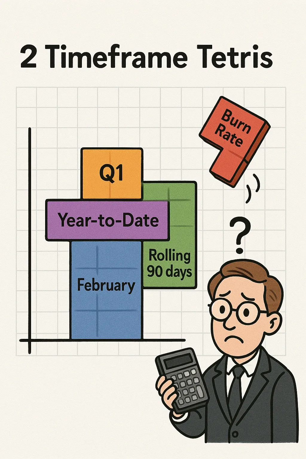
Linear time is for public companies. You’re a startup. You operate in what scientists call a “founder-adjusted temporal field,” where metrics from February, Q4, and Year-to-Date can—and often do—coexist on the same slide. This isn’t a mistake. It’s a narrative strategy.
Each metric tells a story. Some are better told monthly. Others quarterly. And some—like cash burn—are best viewed from the safe emotional distance of an annual figure. The key is to never lock into a single timeframe across the board. That invites comparison. You don’t want comparison. You want flexibility.
Don’t title your slide “February Metrics” or “Q1 Dashboard.” That implies internal consistency. Go with something broader like “Performance Trends” or “Key Signals.” This gives you space to blend whatever time periods make each number look the least alarming.
And if someone notices that churn is shown monthly, revenue quarterly, and runway on a rolling annualized basis? You’ve got your line ready:_“We track different metrics at different cadences based on what’s most actionable for the team.”_Say it slowly, and confidently. You’re not hiding anything. You’re just… operating multidimensionally.
What You’ll Do:
- Mix timeframes freely: monthly churn, quarterly revenue, annualized burn—all on Slide 5
- Remove specific dates or axis labels. Let the chart feel “strategic” instead of precise
- If challenged, say: “These are the cadences we use operationally.” Then move on
Boardroom Dialogue:
Investor: “Why is revenue quarterly but churn monthly?”
You: “Revenue is stable, churn is… exciting.”
Investor: “And why annualized burn?”
You: “Burn is best discussed annually—fewer panic attacks that way.”
3. “Charts That Obscure”
Because no one argues with a chart they don’t understand
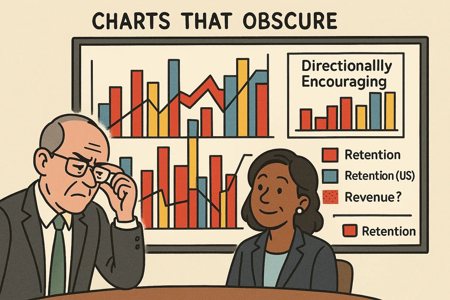
A well-crafted chart should do one of two things:
(a) tell a clear, data-backed story, or
(b) create just enough cognitive friction that no one dares ask a follow-up.
Your job: choose (b).
Start with a classic: pie charts where the slices don’t add up to 100%.
- Paid Search: 43%
- Organic: 37%
- Partnerships: 32%
- Other: 12%
That adds to 124%. But if it’s color-coded nicely, it must be legit.
Then there’s the color shuffle across slides. One slide, the U.S. market is blue. Next slide, it’s red. Third slide, it’s white. Same country, different emotional arc. This creates a mild sense of unease that distracts from any actual performance trend.
Want more chaos? Reuse the same stacked bar chart design for different KPIs—revenue by region, headcount by team, NPS by persona. If the colors and layout are consistent, no one will know what’s being compared anymore.
And when someone dares to point out that the chart is unreadable, inconsistent, or just plain wrong, respond calmly:
“The visual is meant to be directional, not exact.”
Then pause. Tilt your head slightly. Move on. You’ve now subtly marked the question-asker as a “details person.” Valuable in finance, maybe. But are they really strategic?
What You’ll Do:
- Use percentage charts that total 110–140%—call it “multi-attribution”
- Change colors for the same data slide-to-slide with no warning
- Reuse formats across unrelated metrics
- Leave out axis labels completely if the slope is trending up
Boardroom Dialogue:
Board Chair: “This pie chart totals 124%.”
You: “Exactly—multi-attribution.”
Investor: “Why does the U.S. market keep changing colors?”
You: “We’re pivoting our palette strategy. Colors boost morale.”
Remember: clarity invites critique. If a board member fully understands your chart, you’ve failed.
4. “KPI of the Month Club”
Invent a new metric. Use it once. Then never speak of it again.

In theory, Key Performance Indicators (KPIs) are consistent metrics tracked over time to understand the health of the business.
In practice, they are narrative accessories. You don’t track KPIs. You deploy them.
Need to explain flat revenue? Introduce “Quality Revenue Retention.” Need to showcase virality? Roll out “Referral Activation Rate” (but only from a single campaign, in one region, during a holiday week). Need to show improvement where none exists? Enter: “Engaged Core User Yield.”
What makes this tactic truly effective is the inconsistency. KPIs appear one quarter, disappear the next, and resurface—sometimes renamed—two decks later. Definitions shift. Units change. And just when the board thinks they understand the dashboard, you redesign it.
This not only resets expectations—it resets accountability. Follow-up becomes a guessing game. Continuity dies in a sea of acronyms.
And if a board member asks where a previous KPI went? No problem. You’ve got your answer ready:
“It lacked predictive power.”
Say it slowly. As if you’re doing them a favor.
What You’ll Do:
- Introduce new KPIs based on the current story you want to tell
- Remove or rename them when they stop cooperating
- Keep definitions vague and inconsistent to avoid year-over-year tracking
- If questioned, deflect with strategic-sounding language like “evolving analytics stack”
Boardroom Dialogue:
Investor: “Where did ‘Customer Engagement Velocity’ go?”
You: “Oh, that lacked predictive insight.”
Investor: “And ‘Monthly Viral Amplification Index’?”
You: “Turns out virality was seasonal.”
Investor: “Then what’s our North Star KPI?”
You (pause thoughtfully): “Depends—what month is it?”
📆 Conclusion: Control the Narrative, Not the Numbers
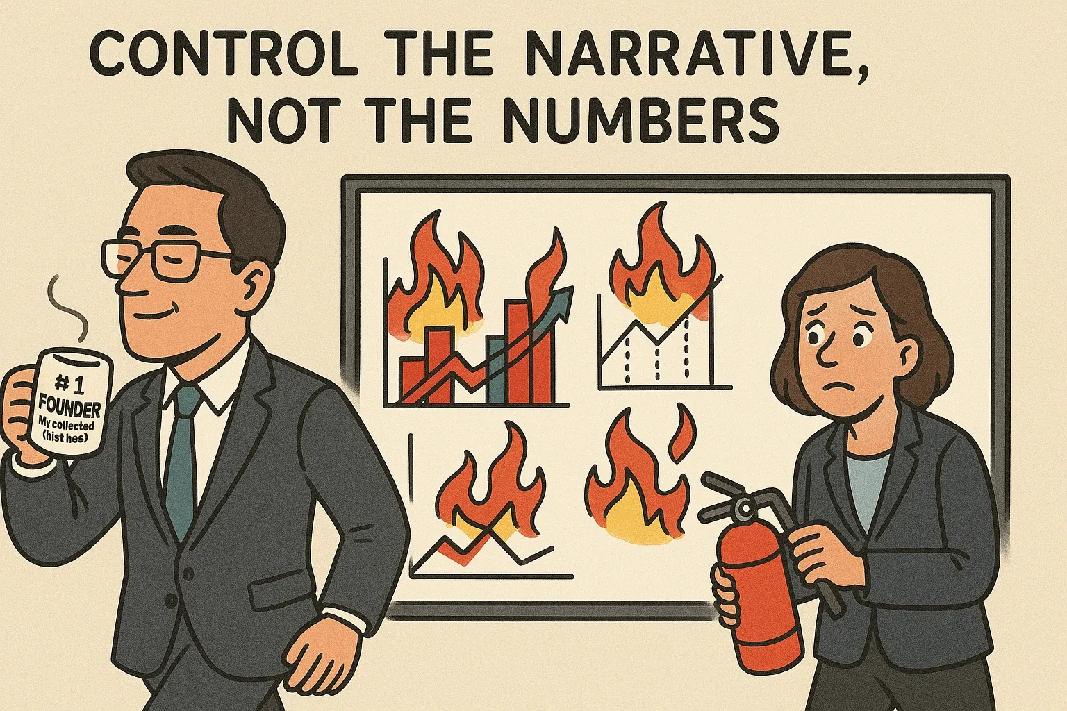
Let’s be honest: the board doesn’t really want “truth.” They want momentum, clarity, and a reason to keep funding you. And if you can’t deliver all three, at least give them a deck that looks like you tried.
So go ahead—change the metric. Swap the timeframe. Invent a new acronym. In the great tradition of startup storytelling, numbers are just supporting characters. The narrative is the star.
And always keep your d&o insurance for startups updated—because someday your board might actually check the numbers.
Numbers aren’t facts; they’re storytelling props. Control the narrative, not the math. And when someone inevitably asks, “Didn’t we measure this differently last time?”—smile warmly and say:
“Exactly. Let’s circle back on that… offline.”
FAQ
What is KPI roulette in board reporting?
What is KPI roulette in board reporting?
KPI roulette refers to the practice of frequently changing key performance indicators in board presentations to obscure negative trends or avoid accountability. This governance anti-pattern involves redefining metrics, shifting timeframes, or introducing new measurements each quarter. According to Harvard Business Review, effective boards should maintain consistent KPIs for at least 12 months to enable meaningful trend analysis and hold management accountable for strategic execution.
How many KPIs should a startup track for board meetings?
Startups should track 5-7 core KPIs consistently across board meetings, according to venture capital best practices. The NVCA recommends focusing on metrics that directly measure business model validation: customer acquisition cost, lifetime value, monthly recurring revenue, burn rate, and runway. McKinsey research shows that boards reviewing more than 10 primary metrics experience 40% longer meeting times without improved decision quality (McKinsey, 2022).
Why is changing metric definitions between board meetings problematic?
Changing metric definitions between board meetings prevents directors from tracking performance trends and identifying problems early. The NACD states that consistent measurement frameworks are essential for fiduciary oversight and strategic guidance. When companies redefine metrics like ‘active users’ or ‘qualified pipeline’ quarterly, boards lose the ability to assess whether management is executing effectively. SEC guidance requires public companies to maintain consistent non-GAAP metric definitions specifically to prevent this manipulation.
What is the best practice for presenting KPI timeframes to boards?
Best practice requires presenting KPIs with consistent timeframes across all board meetings, typically showing month-over-month, quarter-over-quarter, and year-over-year comparisons. Deloitte’s Board Effectiveness Survey found that 78% of high-performing boards require management to present metrics using identical timeframes and cohort definitions for at least four consecutive quarters. This consistency enables directors to identify inflection points, seasonal patterns, and genuine performance changes rather than measurement artifacts.
KPI roulette refers to the practice of frequently changing key performance indicators in board presentations to obscure negative trends or avoid accountability. This anti-pattern involves redefining metrics, shifting timeframes, or introducing new measurements each quarter. According to Harvard Business Review, consistent metric tracking is essential for board oversight, with leading companies maintaining the same core KPIs for at least 12-18 months to enable meaningful trend analysis and strategic decision-making.
How often should startups change their board KPIs?
Startups should maintain consistent core KPIs for a minimum of 12-18 months to enable meaningful trend analysis and accountability. While businesses may add supplementary metrics as they evolve, the foundational KPIs measuring growth, unit economics, and cash runway should remain stable. McKinsey research indicates that high-performing companies track 4-7 core metrics consistently across reporting periods, only changing definitions when there are fundamental business model shifts that warrant board approval and documentation.
What are the consequences of inconsistent board metrics?
Inconsistent board metrics erode trust, prevent effective oversight, and can lead to governance failures. When management frequently changes KPI definitions or timeframes, board members cannot track progress, identify trends, or hold leadership accountable. Deloitte’s 2022 Board Practices Report found that 68% of directors cite inconsistent metrics as a top barrier to effective oversight. In severe cases, metric manipulation can constitute securities fraud if it misleads investors about company performance, particularly for companies preparing for funding rounds or exits.
How should boards respond to frequent KPI changes?
Boards should establish a formal KPI framework that requires written justification and board approval for any metric definition changes. Best practice includes maintaining a KPI dictionary that documents each metric’s calculation method, data sources, and historical changes. The NACD recommends that audit committees review metric consistency quarterly and that boards reject presentations with unexplained definition changes. Directors should request year-over-year comparisons using both old and new methodologies during any transition period to maintain transparency and continuity.
What are standard board reporting KPIs for startups?
Standard startup board KPIs include monthly recurring revenue (MRR), customer acquisition cost (CAC), lifetime value (LTV), gross margin, net revenue retention, cash runway in months, and burn rate. SaaS companies should track the LTV:CAC ratio (target of 3:1 or higher) and magic number for sales efficiency. According to Bessemer Venture Partners’ 2023 State of the Cloud report, top-quartile SaaS companies maintain net revenue retention above 120% and gross margins exceeding 75%. These core metrics should remain consistent across all board presentations.
Part of our Board Member Guide — Your go-to resource for board member roles, responsibilities, and best practices.
Related Reading
Mark Davis
Founder, I'mBoard
Mark Davis is Founder of I'mBoard. Having served on dozens of startup boards, he knows the pains from both sides of the table - as an exited founder/CEO turned investor.